5 Common Visual Mistakes in Construction Proposals & Fixes
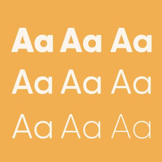
In construction proposals, the content is just as important as the way it’s presented. Many proposals fall short visually, making it harder for evaluators to navigate key information and understand the project’s value. One common mistake is inconsistent formatting. Changing fonts, layouts, or styles from page to page creates confusion and a sense of disorganisation. The solution is to establish a consistent design system that brings cohesion and clarity to the entire document. Another issue is dense, text-heavy pages. Large blocks of text can overwhelm readers and cause important points to get lost. Breaking up text with bullet points, subheadings, and infographics helps make content more digestible and engaging.
Low-quality visuals are also a problem. Blurry images or irrelevant stock photos can undermine professionalism. Custom, high-resolution visuals—like 3D renders or bespoke diagrams—create a stronger impact.
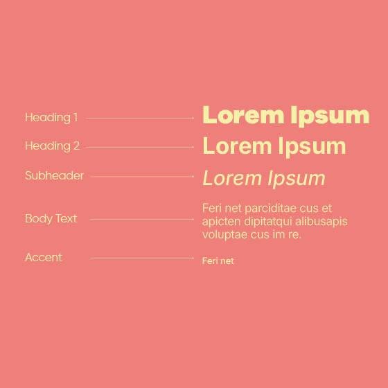
Lack of visual hierarchy can make it difficult for reviewers to find the most important information. Clear, well-designed layouts with strategic use of font size, colour, and spacing guide the reader’s eye. Lastly, many proposals miss the opportunity to tell a story. Data-heavy submissions can feel dry and forgettable but incorporating visual storytelling—such as process diagrams or timelines—adds context and clarity, making your proposal more memorable.
A strong proposal is more than a technical submission, it’s a visual representation of your capability and care. At Unbuilt, we help teams avoid these common mistakes by crafting bids that are not only well-structured and beautiful but strategically designed to resonate with the people reviewing them.


Good design isn’t just about making things look nice; it’s about clarity, structure, and strategy.


